




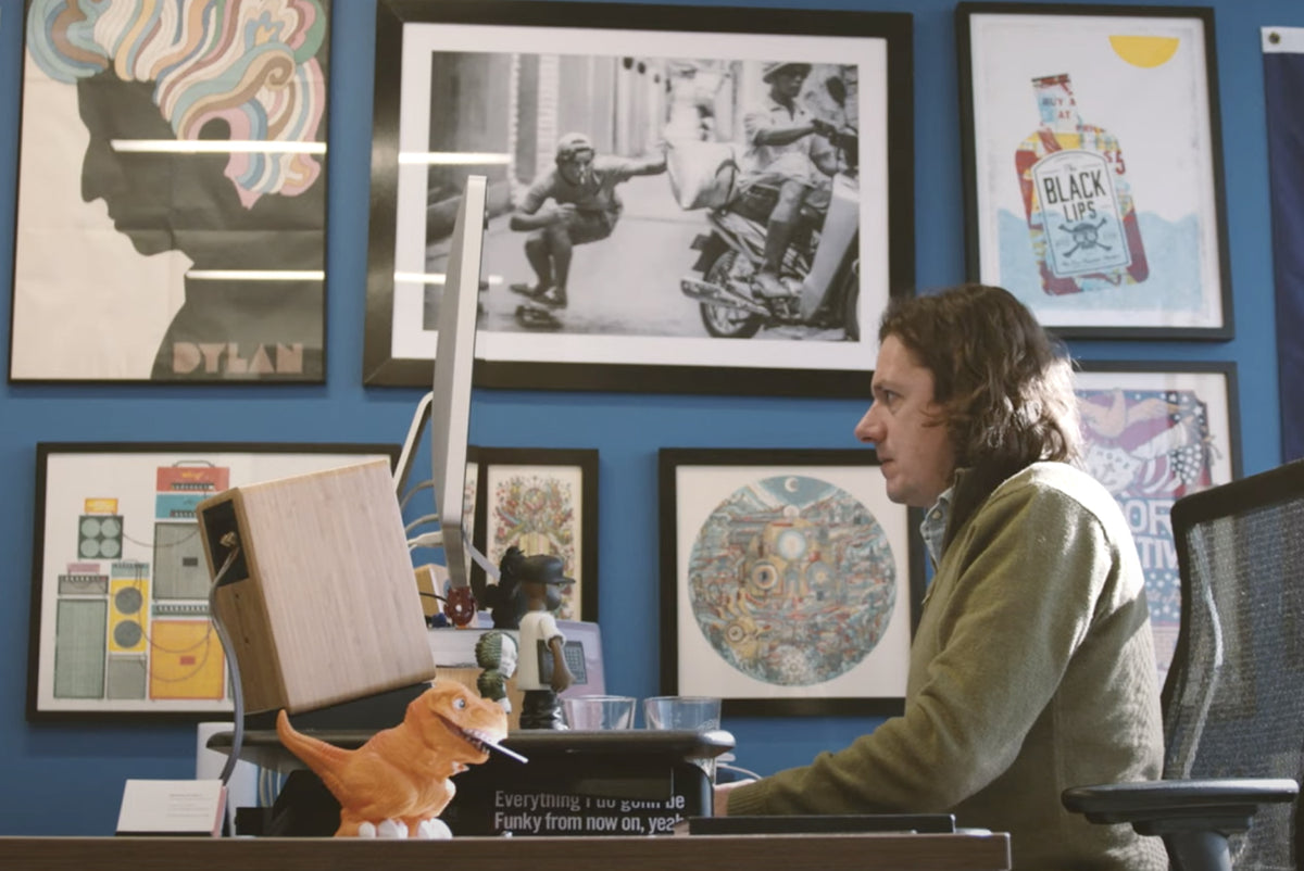
Love the vibes of our fall and winter collection? Thank renowned designer Brian Steely of Steely Works, whose iconic music posters are true works of art. We jumped at the chance to team up with him in a meaningful way. Check out his work – you’ll likely recognize it since he collaborates with brands from beer to bands and cannabis to corporations.

We recently asked Brian to share how he finds inspiration for those jaw-dropping designs – and what it was like to work with the Cycling Frog team. Read on to get all the details.
Cycling Frog: How do you approach a new project or design commission?
Brian Steely: I think about the project for a few days before I start with any design, asking myself, “What would make this work unique and memorable?” I make sure the client agrees with my idea and once it’s approved, I move to the sketch phase.

Cycling Frog: Most of the artwork seems to have a central character. How do you come up with them? Do they start with personality, or do you generally add that later in the process?
Brian Steely: I create the central character making sure it fits with what the client is after. I’m a big fan of symmetry too, so I make sure that is working. Usually the personality or quirkiness comes later as I watch how the illustration unfolds in front of me.

Cycling Frog: Your color palettes are quite unique and striking. What informs these? Do you have a specific style of art you're drawn to?
Brian Steely: I have certain colors that I know work great together. This comes from years of watching various Pantones screen printed on posters, beer & wine labels, and seeing how the colors translate digitally on my computer. I don’t have a particular style of art I’m drawn to; I’m more influenced by the emotion a particular piece inspires. I like to see how I can take a style that has a rigid feel and soften it, making my lines feel organic and natural.

Cycling Frog: What inspired/informed you as you were conceiving the Cycling Frog illustrations?
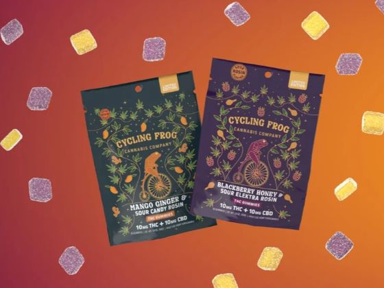
Brian Steely: Working with the awesome team at Cycling Frog – they had ideas, I had ideas – and I think the combination really worked. When I have a client that is passionate about what they are doing it’s always helpful. I loved the idea of these frogs coming to life and doing things like riding a crazy bicycle or sitting on ice.
Cycling Frog: Was there anything specific about the Cycling Frog brand you were trying to capture?
Brian Steely: I really like the product and see how it sits on the shelf next to the competition. I wanted to create something that was eye-catching and fun, but also had a classiness to it. This is a trusted brand and that needs to be conveyed through the label while still having a bit of fun.
Cycling Frog: You came up with the Frog sitting on ice. How did that come about?
Brian Steely: Embrace the Chill – I immediately began thinking about things the frogs could be doing that echoed that tagline. There isn’t a ton of time to catch the consumer’s eye, so it’s important that you get to the point quickly and pull them in for a closer look. Hence the frog sitting on the ice cube or pedaling a crazy looking bike.
Cycling Frog: Are there any other interesting details about your creative/illustration process that you can share?
Brian Steely: I start each day with a long walk, which gets me ready to tackle the day and clears my head. I typically go for another short walk around lunch time. I think getting outside in nature and clearing your head is so important to the design process. I set out every day to create the best work I can. No matter how small or large the project is, each one is very important. I want to be known for creating eye-catching and unique work that makes sense for each brand. If a lot of thought goes into the design, the consumer will recognize that this is a quality product. I don’t take myself too seriously and am always looking for ways to grow and evolve my style. I’m super-passionate about what I do and hope it shows!

Check out more of Brian’s work at SteelyWorks.com.